I have done some research on institution logos because it will give me some background information on what looks good in a institution logo and what doesn't. This research will give me some idea on what logo would fit best before the opening of my horror movie, with the use of colours, the size and the look of the fonts. I researched not just the common institutions that most people will know because it then gives us more of a variety of logos and why some do not look as good as others.
Video Of Different Logos
DreamWorks
Past movies have been; Shrek 1, 2, 3 and 4, Megamind, How To Train Your Dragon, Over The Hedge, Kung Fu Panda 1 and 2, Flushed Away, Shark Tale and many more.
However, this logo wouldn't look good at the beginning of my horror movie because it doesn't look like it could appear at the beginning of a horror movie.
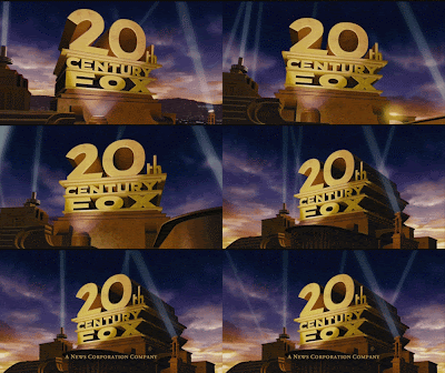
20th Century Fox
The 20th Century Fox logo is very different to DreamWorks. This logo makes the institution look important because of the spot lights that are shining on and around the main text. The spot lights also turn and shine on the main text, giving a feeling that it is important and that the audience need to look at what to spot lights are shining on because it is so good. The main text stands out because it is bold and in the colour of gold that makes it seem superior to the audience. The main text looks like it is standing on a podium, giving a feeling that the audience are being privileged because the audience are watching a film that has something to do with 20th Century Fox. This logo is very intense and makes the audience feel like they are going to watch a action, comedy genre or something that is going to excite them and the logo gets them rearing to watch.
Some Films and Tv Programs are; American Dad, The Cleveland Show, The Simpsons, How I Met Your Mother, Marley And Me, Independence Day, Life Of Pi, Skyfall, New Girl, Diary Of A Wimpy Kid 1, 2 and 3 and many more.
This logo could appear at the beginning of my horror movie, because it is a well known institution and has done some horror movies in the past.
Universal Studios
Some Films that there have been; Harry Potter 1, 2, 3, 4, 5, 6, 7 and 8, Love Actually, Despicable Me, Pitch Perfect, Ted, Bridesmaids, The Purge, Curse Of Chucky and many more.
This logo could appear at the beginning of a horror movie because they do have another darker option that could be used for a horror movie and they also have done horror movies previously.
Focus Features
This institution's logo links with the name 'Focus Features'. The background is colourful but blurred which contrasts with the name of the institution because it is not focused. The colour goes from dark blue in the middle, to a orange/yellow and some light blue colours on the outside, so that the writing can be seen and stands out more, making it easier for the audience to read the writing. The circles look like they are zooming out because they start off small and get bigger the closer to the edge of the logo they get. This gives the effect that they are moving even though they aren't, making the logo more interesting to look at. The writing is in a yellowy colour, with Focus bigger then Features. The 'O' is blurred out, making the logo more creative and would look like not all of the writing is focused, contrasting again with the name of the institution.
Some Films that there have been; The Worlds End, ParaNorman, One Day, The Eagle, 9, Thirst, Coraline, Shaun Of The Dead, Scoop and many more.
This wouldn't be as suitable for my horror movie because it is colourful and isn't as effective as other logos that I've researched.
Working Title Films
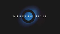
This logo is a very dark logo. The background is black, which makes the blue and the white stand out more. The black also gives a very dark and gloomy atmosphere and a sense of mystery for the audience. The blue with the black ring within it makes the logo a bit brighter and would stand out in the cinema because it would be very bright on the black background. The blue is lighter in the middle and gets darker, looking like it is fading out, making the logo that little bit interesting to look at because it is so bland but at the same time very effective. The title, 'Working Title', it pure white, standing out from the background. It would make the audience concentrate of the title most because it would be the brightest bit of the logo. The white stands out the most, making it look like it is the most important bit in the logo, which is it because it is the title of the institution. This is very cleverly done because it means that the thing this institution want the audience to remember is the title of the institution so they have made it the brightest and boldest thing for the audience to look at.
Some Films that there have been; About Time, I Give It A Year, Paul, Nanny Mcphee, The Boat That Rocked, Wild Child, Mr Bean's Holiday, Hot Fuzz, Bridget Jones 1 and 2, Notting Hill and many more.
This would be as suitable for my horror movie because isn't colourful and is effective.
Paramount Pictures
This logo stands out because there is so much going on within the picture. The background is one big mountain, with little ones in the distance with either a sun rise or a sun set. Around the biggest mountain is a circle of stars with 'Paramount' within the circle. This shows that the writing has an importance. The title 'Paramount' is in a silvery whitish colour, which stands out from the background more and it also fits in well with the snow and the winter theme that the logo has because of the mountains. The logo has a very calm effect because it is all very still, with a landscape of mountains and the beautifulness of the surroundings which would make everyone who was looking at it feel happy. at the bottom in a big font is the number '100' with a smaller 'years' next to it. This shows that they are proud to have been going for a 100 years and that they want audiences to know that they are a successful institution and that they are proud of their business.
Some Films that there have been; Hansel And Gretel: Witch Hunters, Paranormal Activity, Titanic, The Devil Inside, Thor, Rango, The Lovely Bones, Iron Man, The Duchess, She's The Man, Sweeny Todd and more.
This particular logo wouldn't be as good to use because the colours are too bright and would give the audience the wrong idea of what genre film they are going to watch.
Columbia Pictures
This logo again has clouds in the background. This gives a calm feel to the logo. It also shows that the logo is high up in the clouds, showing that it is superior and a big, strong company. The woman standing in the middle on a podium is well known that it has something to do with the institute because it appears whenever the institution comes up before a film or in a magazine. This shows that they have thought about marketing a lot and made sure that they have a symbol that represents them so that the audience will remember. 'Columbia' is in a big font and stands out because it is in a bright colour. The 'U' in 'Columbia' has a flash where the sun should be amongst the clouds, which brightens up the logo, making the text stand out more and be almost holy. There is smaller writing that isn't as important as the name of the institution. That is shown by the fact it is at the bottom and is in a smaller font, so the audience have a choice on whether they want to read it or not.
Some Films that there have been; The Grudge, Ghost Rider, Hitch, 50 first Dates, Stewart Little 1 and 2, Dracula and many more.
This logo could appear at the beginning of a horror movie because they do have another darker option that could be used for a horror movie and they also have done horror movies previously.
Sony Pictures Animation
Past movies have been; Open Season 1, 2 and 3, The Smurfs, Surfs Up, Cloudy With A Chance Of Meatballs and many more.
However, this logo wouldn't look good at the beginning of my horror movie because it doesn't look like it could appear at the beginning of a horror movie.
Warner Brothers Pictures
This logo has clouds in the background again, showing that 'Warner Brothers' is very high up because it is all the way in the clouds. There is a gold shield in the middle of the picture, further more showing that this institute is important and superior because not all of them have a gold shield. The fact that the shield is in the middle means that it is the most important thing within the picture, therefore it is what they want the audience to see most. There is a lot going on in and on the shield which adds to the thought that they are proud of their institute. 'WB' is also gold, so it even further shows they are proud of their institution. The shield is a well known that it is linked to Warner Brothers Pictures because they have done a lot of advertisement in order to get audiences to remember it. The writing below again is in gold but it smaller, showing it is not as important to read but still is important to the institute.
Past movies have been; The Conjuring, The Hangover 1, 2 and 3, The Dark Knight, BeetleJuice, The Cell, 17 Again, Man Of Steel, Addicted To Love and many more.
This logo could appear at the beginning of a horror movie because they do have another darker option that could be used for a horror movie and they also have done horror movies previously.
New Line Cinema
This logo is again quite basic but it has the most important information within. The black background makes the audience focus more on what is in the middle of the picture, which is the logo and the white writing. The logo is black, but has blue behind it so that it stands out otherwise the audience would not be able to see it because it would be black on black. The blue also highlights it and makes it stand out more. 'New Line Cinema' is in a big font and is bright white, meaning it will be so much brighter on a black background and will stand out more on a black background. The smaller writing is also white so it stands out well on the black background, but it is slightly smaller which proves it is less important to the audience.
Past movies have been;The Conjuring, The Hangover 1, 2 and 3, The Dark Knight, BeetleJuice, The Cell, 17 Again, Man Of Steel, Addicted To Love and many more.
This logo could appear at the beginning of a horror movie because it's dark and could be used for a horror movie and they also have done horror movies previously.
Walt Disney Pictures
This logo is quite obviously Disney. The whole photo is every child's favourite place to visit, whether they have been there or not. The Castle in the middle at the back signifies Disney because it is the Castle at which everybody knows is related to Disney. The sky is blue with stars and pinkish clouds, which all gives an element of fantasy and looks like a really happy, fun place to be. The whole picture is very bright, with lots of things going on which would get the audience excited to watch the film and would make everyone raring to watch the film. 'Walt Disney' is in the stereotypical font that Disney use which then makes this have an instant connection to the institution. The Writing also looks like it is sparkling, which makes it look pretty as well as looking expensive and special.
Some past movies are; Alice In Wonderland, Finding Nemo, Toy Story 1, 2 and 3, Oz The Great And Powerful, Tangled, Pirates Of The Caribbean 1, 2, 3, 4 and 5, Brave, High School Musical 1, 2 and 3 and many more.
However, this logo wouldn't look good at the beginning of my horror movie because it doesn't look like it could appear at the beginning of a horror movie and only does young movies.
This logo is very basic. It has a plain background meaning that the audience will focus more on what the writing is saying. 'Pixar' is in black, meaning it will stand out more against the lighter background. The I in Pixar is a lamp, with the light facing the audience. The lamp is something most people would associate with Pixar if they saw it and it is sort of their logo. The smaller writing is also in black but it is smaller meaning that it is less important for the audience to read, but is still readable if the audience wish to read it.
Some past films are; Cars, The Incredibles, UP, Bugs Life, Walle, Finding Nemo, Monsters Inc, ratatouille, Toy Story 1, 2 and 3 and many more.
However, this logo wouldn't look good at the beginning of my horror movie because it doesn't look like it could appear at the beginning of a horror movie and only does young movies.
