Monday, 24 February 2014

Evaluation - Question 7; Looking back at your preliminary task, what do you feel you have learnt in the progression from it to the full product?

I had to split my evaluation into two sections because it was too big a file to download whole. So here is question 7 split into part 1 and part 2.

Part one:


Part two:


Evaluation - Question 6; What have you learnt about technologies from the process of constructing this product?


Evaluation - Question 5; How did you attract/address your audience?


Evaluation - Question 4; Who would be the audience for your media product?


Evaluation - Question 3; What kind of media institution might distribute your media product and why?


Evaluation - Question 2; How does your media product represent particular social groups?


Evaluation - Question 1; In what way does your media product use, develop or challenge forms and conventions of real media products?


Evaluation Brainstorm


                                  Evaluation Brainstorming


Friday, 14 February 2014

Finished Horror Opening


Editing My Horror Opening

                                              Editing My Horror Opening

I did videos and screenshots of my editing process, I didn't do every step, but I did do the most important edit steps that I did.

Adding A Clip


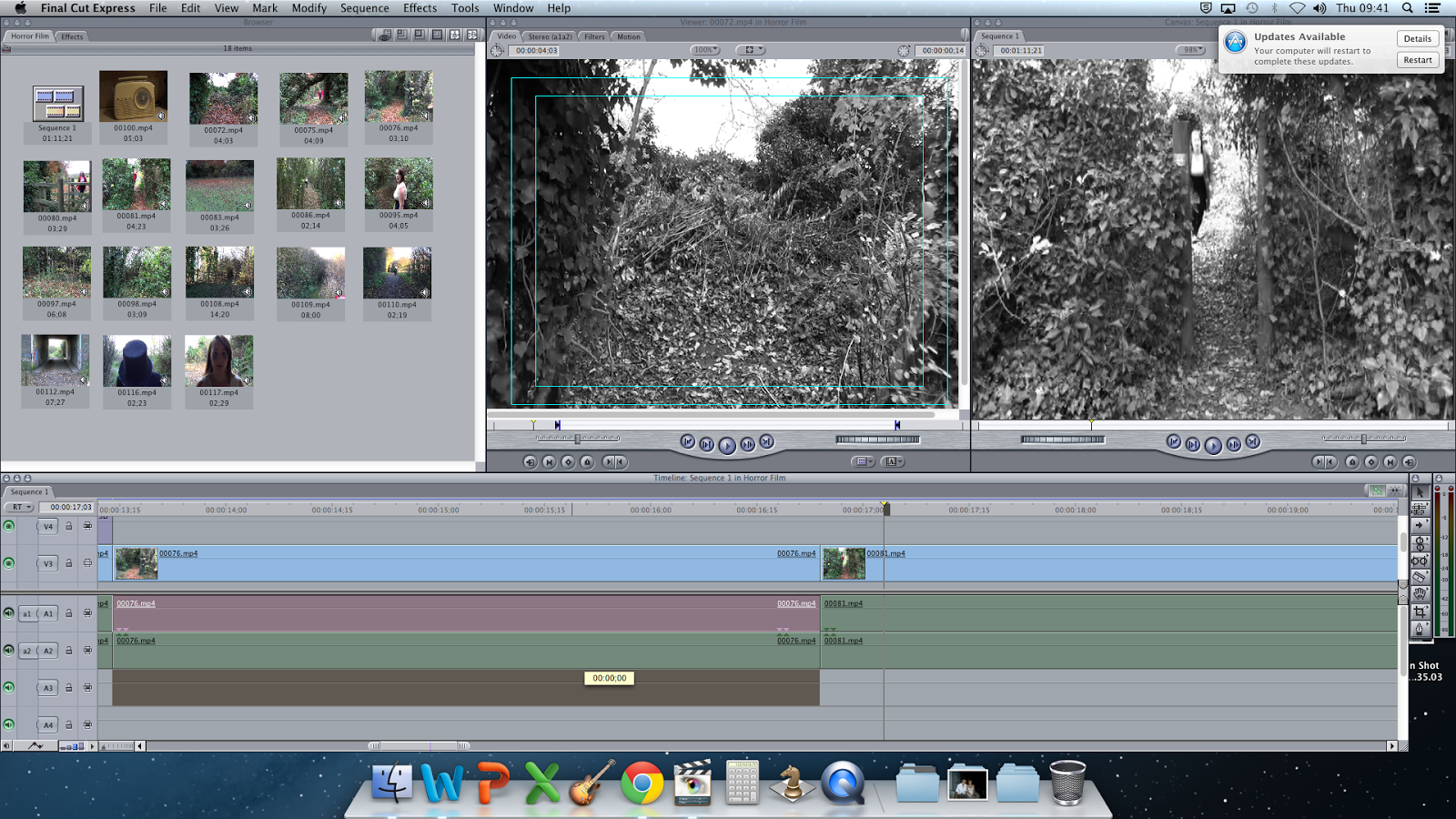
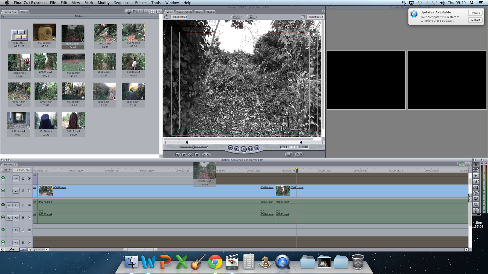
To add a clip in the right place, I had to crop it by pressing the "I" button for where I want it to start and "O" button for when I want the clip to end. Then, I dragged the clip from the middle screen and put it where I wanted it to be in my horror opening. Then I had to render it before I could watch it to see if it looked ok. 


Changing The Clip So There Is No Sound


To change the clip so there is no sound, I needed to drag the audio bars up to the section which I had muted any sound, then when I played it back there was no sound playing where I wanted it to be muted and then there was sound when I wanted there to be sound.


Changing Image Filter 


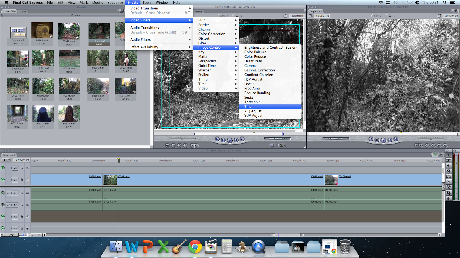
To change the filter from normal coloured to black and white, I had to go on "Effects", then "Video Filters", then "Image Control" and then press "Tint". Then I had to render it, by pressing command and "R", then when I played it back the colour would be black and white instead of colour. I had to do this process for every clip I had. 


Adding and changing text

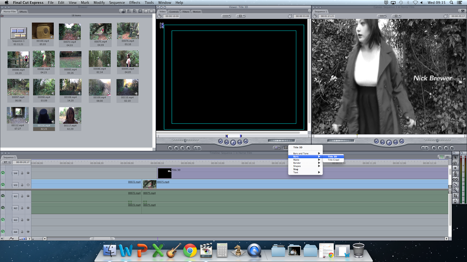
To add text, I needed to press the "A" on the right hand side of the middle box, then press "Boris" then "Text 3D". This would then take me to a black screen and I had to go on "Controls" and then I could change what I write, the font it is and so on. Once I had got the text I wanted and in the right position, I dragged it down to the line above the film line and cut it to where I wanted it to stop.
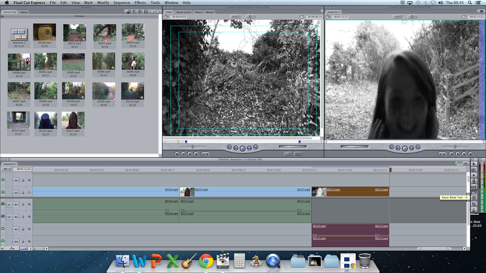


Splitting My Clip So I Just Have The Sound Of The Scream

To split my clip in two, I had to click on the splitting tool on the tool bar to the right of the screen. Then I had to find the place just before Jodie screamed, which took a lot of trail and errors before I found the right point. I then dragged the section where I don't need the sound for up to the mute section, so when I played it, it starts off quiet, missing the sound of cars, and then the only thing I can heard is the scream. 
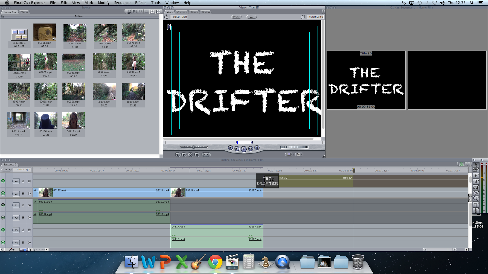


Adding In The Title

To apply the title, I started by doing the same process I did for applying any other text I wanted, but this time I used a different font. The font I used was "Chalkduster" and the reason I used that font rather then "Chiller" is because "Chiller" wasn't on the mac's, so instead I tried to find another one that looked just has spooky. This font also looked like a character within my horror opening could have written this, therefore it has more of a connection to my film. 

Adding A Warner Brothers Logo and Adding My Own Sound to it


I decided to use a Warner Brothers beginning as well as my own institutions beginning because it made my opening a bit longer. It also built more tension to my opening. The song I used was just a mixture of different types of low notes put together, which made it sound scarier. 


Adding And Changing The Colour Of My Institution


To add in the clips, I did the same process as I did for the other ones, but I had to put the same clip in three times because just having one clip was too short, so I made it longer by putting the same clip in three times.

I didn't want my institution to be the normal colours, so I decided that I wanted it to be in Sepia rather then Black and White because the rest of my opening is Black and White. I went on Effects, Video Filters and then Image Control and then went on Sepia. I also so made the image blurred, to give more of a distorted effect. 


Adding The Music Into My Institution


To add music into my institution, I had to get my music, which is copyright free, off of my documents and then I had to drag it from there onto my opening. I had to drag it underneath the others because I knew that it was going to be longer then I needed and I didn't want it to cut some of my music out.


I then cut it, by using the 'cutting tool' on the toolbar. I cut it firstly in the wrong place, so I then had to undo it and re-cut it in the right place. The music didn't start straight away either, so I cut it so that when my institution started, so did the music.


I then had to fade in and out both of my music files. To do that, I needed to click on the arrow in the bottom left hand corner, then click the 'show audio waveforms' button, then I clicked the zigzagged line and then moved the lines so that it faded in and out when I wanted it to. 


Adding In James's Voice-over


To add in James's voice-over, I had to go onto the folder it was in and click and drag it to the point that I needed it to be in. I found out that it was slightly too long, which is one reason why I added pauses, so that if it was too long or short I could change it to make the pauses longer or shorter. I cut one pause out and then it was just long enough to then add a copyright free sound effect of a heartbeat. 

Thursday, 13 February 2014

Final Institution Logo

                                   Final Institution Logo 


This is my final logo. I decided to change from my original logo because I think this one is more effective and links in with my opening a lot better. This logo also fits in well with my institution clip because the institution clip is of Willow screaming, so the hands represent what happens after the screaming.
I feel that having a black background is better then having a white because it looks scarier and the red shows up better. The font I used was 'Chiller' which is a spooky font and is more exciting to look at then for example 'Times New Roman'.


What My Final Institution Looks Like Without Sound


Tuesday, 4 February 2014

Script For The Voice Over

                                Script For The Voice Over

Last night a young woman was murdered

(2 second pause)

She was travelling alone...

 (2 second pause)

In the depth of the dark forest

  (2 second pause)

Where no one could hear her screams

 (2 second pause)

The murderer is still out there

(2 second pause)

No-body knows where he is

(2 second pause)

Or what he is doing

(2 second pause)

Or where he will go next

(2 second pause)

All we know is that he is dangerous

(2 second pause)

And he won’t stop at anything

(2 second pause)

To get you

(2 second pause)

Do not leave your home at night

(2 second pause)

Do not travel alone

(2 second pause)

Or he could be near you

(2 second pause)

Watching you

(2 second pause)

Waiting for you

(2 second pause)

And when he finds you

(2 second pause)

And he will

(2 second pause)

(whisper) Run...


Annotated Version


I am hopefully going to get my friend James Wayman, to be the voice over because he can do a variety of different voices, so he can do the voice that I want for my opening. The voice I want is a deep and slow voice, so that it creates more tension and makes it more eerie for the audience to listen to.

Friday, 31 January 2014

Final Timeline For My Opening

                       Final Timeline For My Opening

I used screenshots from my clips that I  filmed and put them in the order that I wanted my opening to be filmed in. This gave me a guide to when I edit my film and it was useful to me because it meant that I knew what clips to put in where.


Thursday, 30 January 2014

Uncut With Institution And Title

                       Uncut With Institution And Title

I created my uncut again but this time with the institution and title that I would like to use in my horror opening. I thought that it all worked well because the institution flowed into the opening and then with the title, it flashed up once she had screamed, so that worked also worked well. The only probably I currently have is with the font because I want to use a font called 'Chiller' for the title of my film but that particular font isn't on the mac, so I might have to think of a new font instead.


Friday, 24 January 2014

My Uncut In Different Colours

                        My Uncut In Different Colours

Black and White

This is the colour that I am going to go for because I feels it gives the most atmosphere and I feel that my horror opening looks best in that colour. Black and white would make it look scarier because it looks darker.


Sepia

This colour worked ok, but it looked unrealistic because it made it look too edited. It wouldn't have given the same feel to it because it looks too edited, so it wouldn't have been as scary or had a greater atmosphere then if it was in black and white.


Normal

I feel that this makes it look more boring and normal and doesn't give a greater feel because it just looks like a girl running through the forest, therefore it doesn't have as much as an atmosphere, therefore I don't want to use this one.


Monday, 13 January 2014

Opinions On My Uncut Version Of My Horror Opening

       Opinions On My Uncut Version Of My Horror Opening

This is my uncut version, which doesn't include the voice over or any editing so there are long periods before Jodie starts to move in some clips but that doesn't matter too much because it is only a rough version.

I have done my uncut in different colours to see what colour I think that my opening will look best in. I decided to go for black and white because I feel that it looks best and creates a better atmosphere.

 I decided to show this to a few of my friends and family members to get their opinions on what it looks like at the moment and whether they think that the order the clips are in should be where they are or whether they should be in another place.


These are the four questions as a guide for them to follow after they had looked at my uncut version;

1. Do you think the colour of my horror opening is appropriate or do you think it should be darker/lighter?

2. Do you think the sequence of all my clips is right or do you think there should be a different order?

3. Do you think that there are any clips that I don't need in my opening?

4. What is your overall opinion on my opening?


Opinions

Person 1: 

I think that black and white is a good idea and adds more atmosphere to your opening but I think that it should be a bit darker if possible to make it even more scarier. 

I think that it is a good order to have your clips in but I think that you should maybe consider removing the clip of Jodie before we then see her run down into the bridge area.  

I think overall your opening is good without any edits but you can't really get the full feel of the opening when there are no edits and all the clips have bits that you could delete. 


Person 2:

I think that black and white is better than your opening being normal because it adds more tension to the opening. 

I think that the order of the clips is good and flows from one into another. 

I think that in all your opening is good but will be better hopefully when you edit it.


Person 3:

I think that your opening would be better in colour in some way because it would make it look more realistic but in other ways it looks better in black and white so it is up to you.

I think that the order is ok but could be improved by putting them in different orders.

Overall, I think that it is good and will be even better once you have edited it.


Person 4:

I think that your opening looks great in black and white and it should be darker because it will add more tension to it.

I think the order is great.

Overall, I think that it looks great and looks like an opening of a movie rather then a movie trailer. 


Person 5: 

I think that your opening of your horror looks good in black and white because it looks older like the date it is supposed to be set in. 

I think the order is good but maybe a few tweaks to make it look even better.

Overall, I think that your opening is good but when it's edited it should look even good.